(click to enlarge)

This is a thematic map of percent of Black people per county as of the 2000 census. Darker colors mean a greater concentration (percentage) of Blacks in the county. White means either that the data wasn't available, or that there were no Blacks reported to be living in the county. As you can see, there is a high concentrations of Black people in the south. This is probably due to the fact that after then end of slavery, many Blacks just continued to live in the south. There are also quite a few Blacks in parts of California, but very few in between (especially in the north).
(click to enlarge)
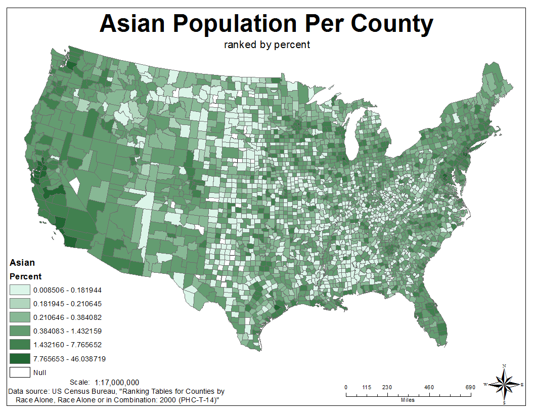 This is a thematic map of percent of Asians per county as of the 2000 census. Again, darker colors mean higher percentage of Asians, with white either meaning that data wasn't available or that no Asians were reported living in the county. As you can see, most Asians live along the coasts, especially in the San Francisco Bay area. There are very few Asians in the interior of the country.
(click to enlarge)

This is a thematic map of percent of people per county who checked "some other" as their race on the 2000 census. Some other is basically everything besides White, Black, Asian, and Pacific Islander. Most people who claimed they were "some other" live in the western part of the US and also small concentrations along the East Coast. The Mid West interestingly, however, has very few "Some other." My best guess as to why is that "some other" is probably consistent of mostly immigrant who immigrated to a coastal area. They have no reason to move to the Mid West, because everyone they know are also probably living on the coast.
Census data provides vast insight into the location, ethnicity, and movement of people around the country. It's nice that the US Census Bureau provides all this data completely for free, so even beginners like us can make beautiful country-wide maps of the population. Looking through the plethora of data the census provides, I thought of tons of different maps I could make using the data. The three above maps are relatively simple, just graphing the population of one ethnicity each, but they still turned out to be very informative.
My overall impression of GIS:
This Intro to GIS class has been very enjoyable for me. I've always been curious about things like map projections and making maps, and I also like working with computers, so this was the perfect class for me. Since I'm an electrical engineering major, I can't take any more GIS classes without minoring in GIS, so now I'm seriously considering going that route. GIS seems like a very powerful and useful tool for almost any industry, so having GIS skills I think will be very useful for me in the future.
No comments:
Post a Comment